
Designing loyalty and community flows for the YUST App
Role: UX/UI Designer (final year project) — IFAPME, 2025
Scope: Research → concept → hi-fi UI system → usability testing → iteration
Overview
For my final UX Design project, I focused on enhancing guest engagement and direct revenue for YUST Hotels through the design of the YUST App, a digital platform connecting guests, locals, and the brand’s lifestyle community.
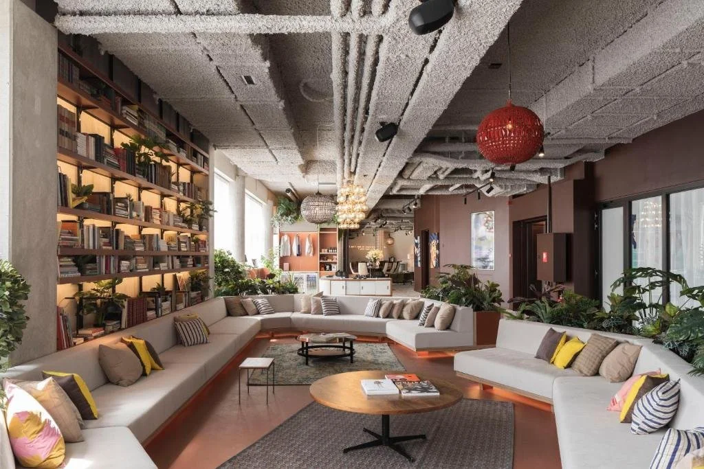
Before I designed for YUST, I worked inside it, as part of the guest-facing team at YUST Housing in Liège. That gave me a starting point most final projects don't have: real familiarity with the guests, the rhythm of the space, and where the brand's hybrid short-stay/long-stay model created friction for both staff and visitors.
The project explored how loyalty and community features could strengthen YUST’s hybrid hospitality model, which blends short stay and long-term stays. Through research, benchmarking, and user testing, I designed loyalty and event flows that reflect YUST’s modern, human, and community driven brand identity.
The goal was to create a seamless, engaging, and loyalty oriented experience that encourages direct bookings, fosters connection, and enhances the overall guest journey.
The brief I set myself
YUST's model blends short hotel stays with long-term community living—a genuinely unusual hospitality format. I chose to focus my final project on a real gap I'd observed on the ground: the brand had no digital layer connecting guests to its loyalty perks, its community events, or a reason to book direct instead of through a third-party platform.
Research
I grounded the project in direct input rather than assumption: interviews with two internal stakeholders and two target users, plus a competitive field visit to CitizenM Paris to study how a comparable brand handled loyalty and direct-booking incentives in practice.
-
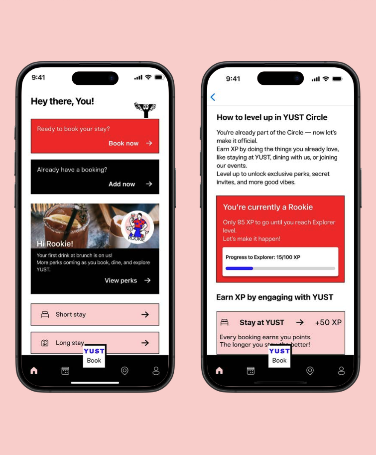
Personalized greetings, tier status
Sense being part of the community directly
Knowing how to engage more and direct benefit for them
-
Create an intuitive, brand aligned App experience
Integrate loyalty as part of the guest journey
Increase direct bookings and in-app engagement
Design process. From concept to interface
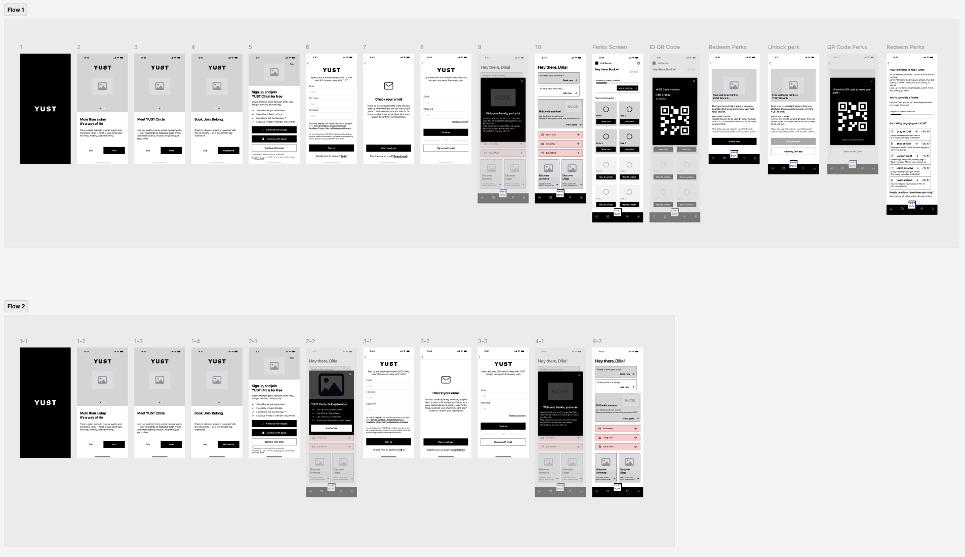
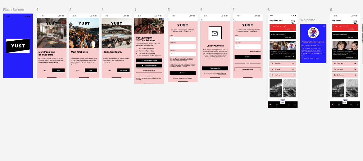
I moved from low-fidelity wireframes into a full hi-fidelity UI system, then tested the prototype and iterated based on what I saw.
Two concrete changes from that test round: I moved the navigation bar to solid black to calm down visual noise, and I re-hierarchized button color (black for primary actions, blue reserved for YUST Circle-specific actions) so the interface communicated priority instead of competing for attention.
Visual & brand system
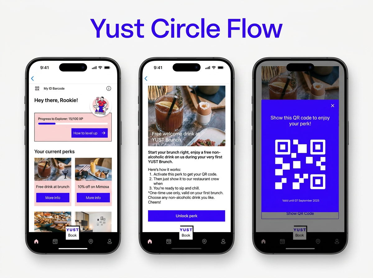
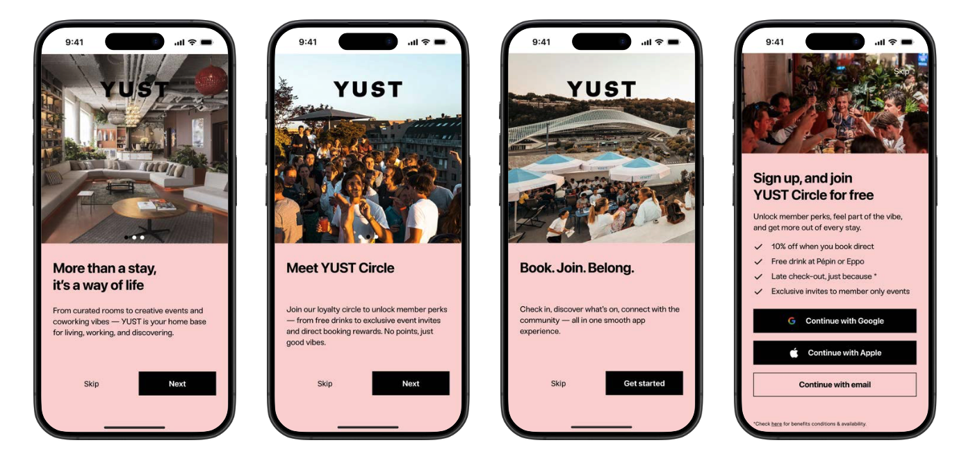
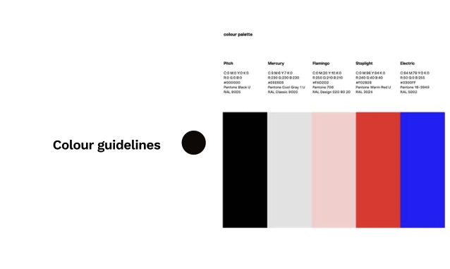
Beyond flows, I built out the full interface language (typography, color palette, componentry) aligned to YUST's existing modern, minimal brand identity, since this wasn't just a UX exercise but a full UI ownership piece.
Outcome
This was my final capstone project, completed with high distinction. The concept moved beyond the classroom, I had several follow-up meetings with ThinkBig Hotel Consulting to explore developing it into a scalable template product for other hospitality brands.
Ultimately the project didn't move forward due to funding and investment constraints on their side, but the validation that a real hospitality consultancy saw enough potential in the concept to pursue it further is, to me, the strongest signal that the direction was right.