

COOL PRESSING
UX research that uncovered a bigger problem than the brief
Role: UX Designer (research, IA, wireframing) @ Synchrone Digital Agency, 2026
Scope: UX audit → user research → concept validation → design handoff
The brief
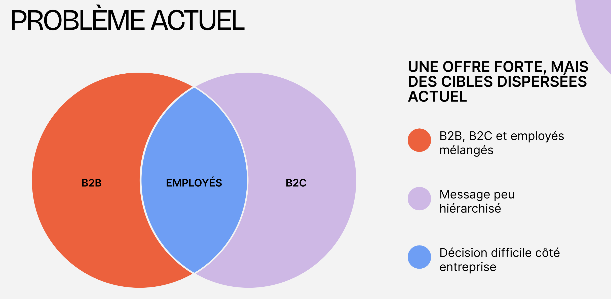
The client (a laundry/dry-cleaning subscription service backed by investors) came to the agency asking for a UX audit and a refreshed landing page. Their website wasn't converting, and the assumption was that the page itself needed a facelift.
What I found
Before touching any screens, I ran a UX audit of the existing site and flow. The issues I found went deeper than layout: unclear user roles and statuses, a gap between what the site promised (a fluid digital experience) and the operational reality (phone calls, 72-hour delays, heavy human intervention), and friction around billing that risked losing users before activation.
A landing page refresh wouldn't fix any of this , the problem was structural, not cosmetic.
Making the case for deeper work
I proposed expanding the scope: proper persona research, journey mapping, and prototype testing before any redesign. The client approved it.

Research
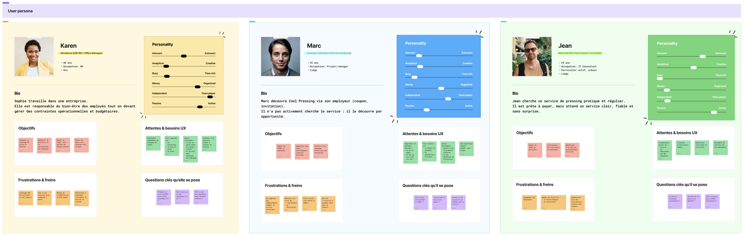
I built three personas around the service's actual business model — a B2B decision-maker (HR/office manager), a B2B2C employee (activated via their employer), and a B2C individual subscriber — and mapped each one's journey to identify where trust broke down.
Each persona turned out to have a distinct blocker, not a shared one: value clarity for the decision-maker, commitment hesitation for the employee, subscription anxiety for the individual.
Validating with real data
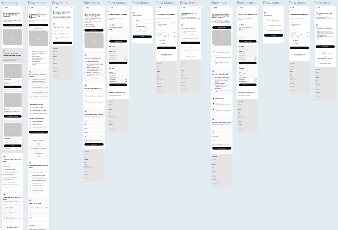
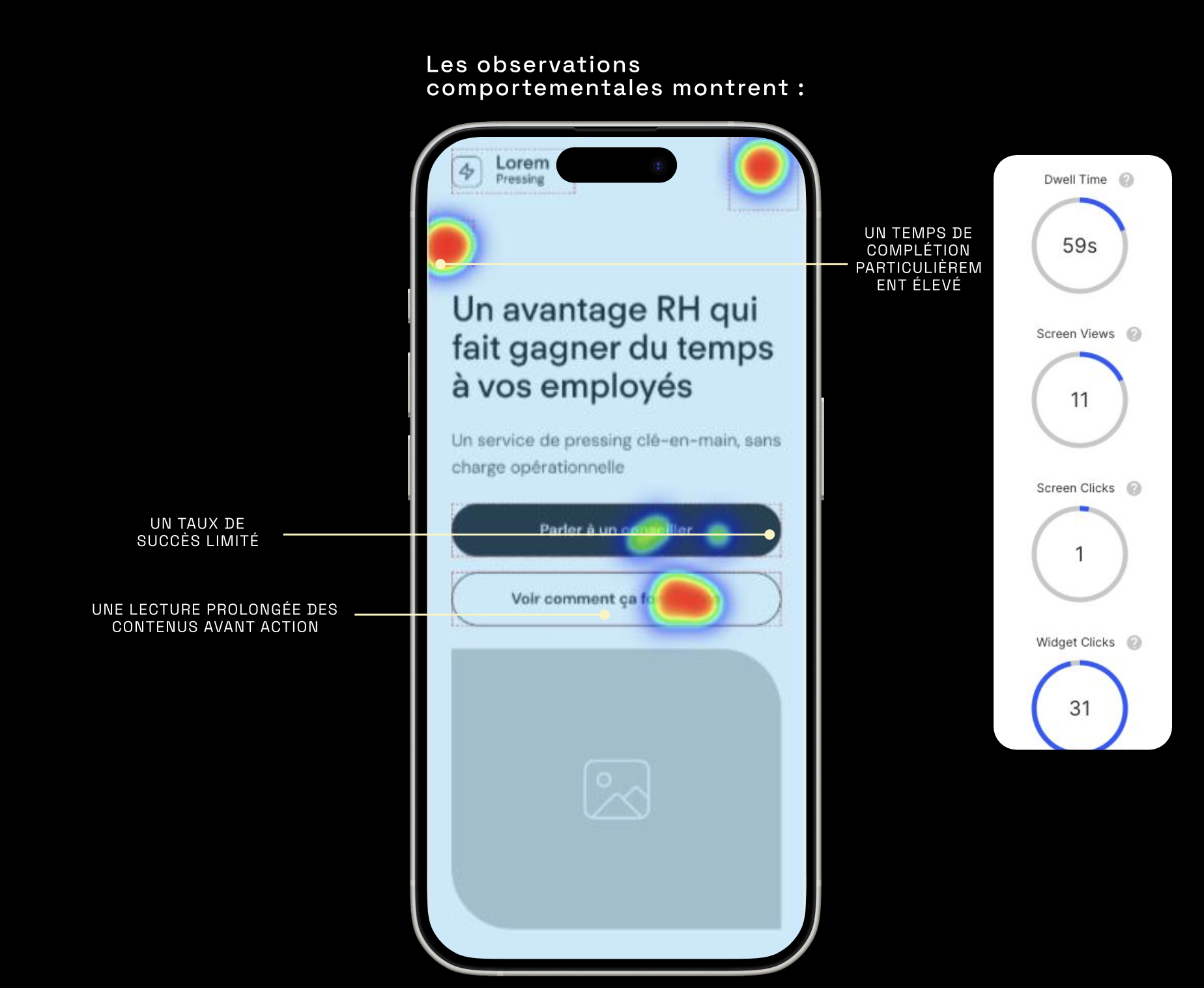
Rather than design on assumption, I built wireframes and tested them with real users via QuantUX, measuring success rates, dwell time, and click behavior across all three segments.
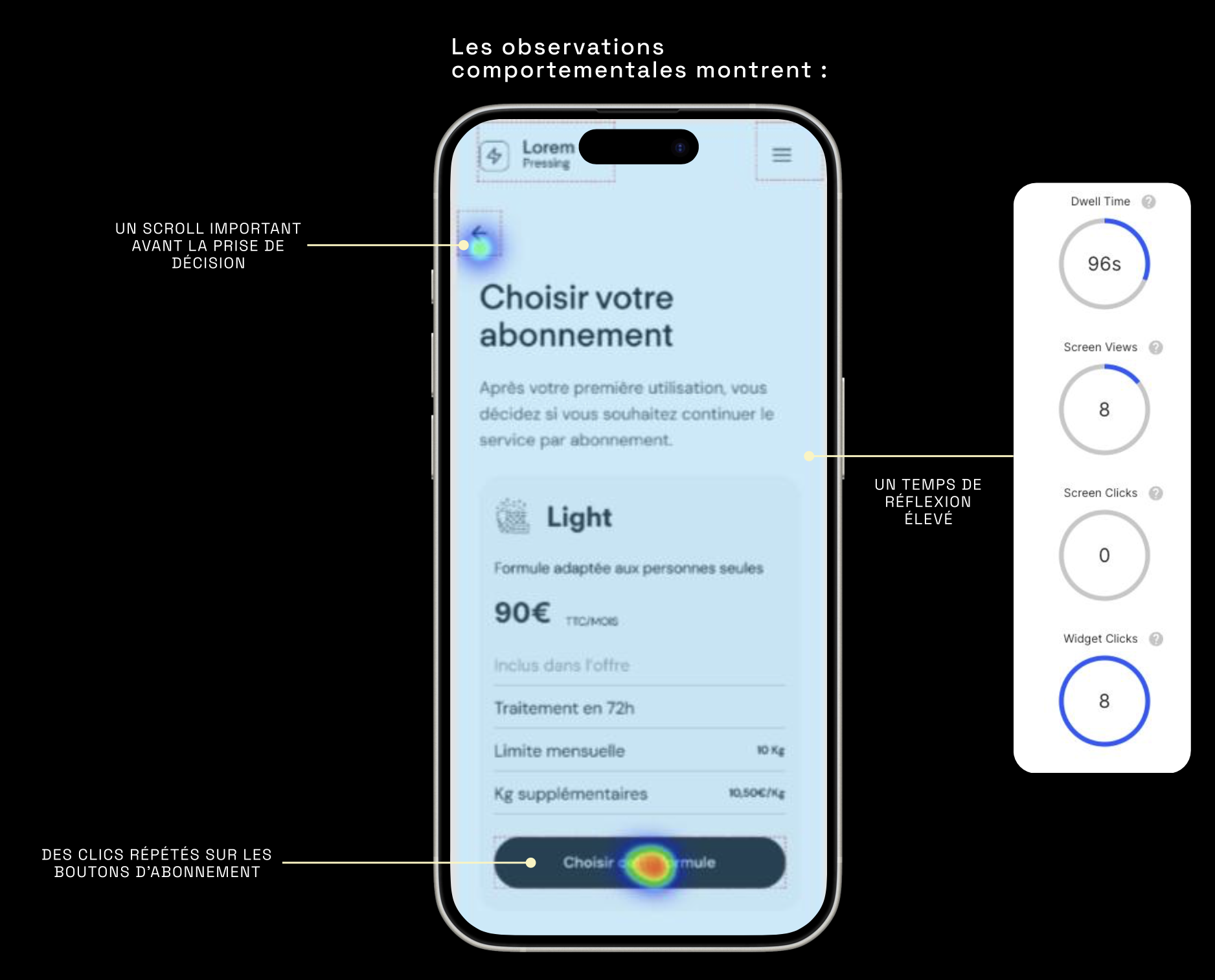
Business segment: 56% success — friction was about value clarity, not usability. Heatmaps showed long reading time before action, concentrated on ROI and operational-burden questions, not confusion about how to navigate.
Employee segment: 63% success — hesitation centered on commitment terms.
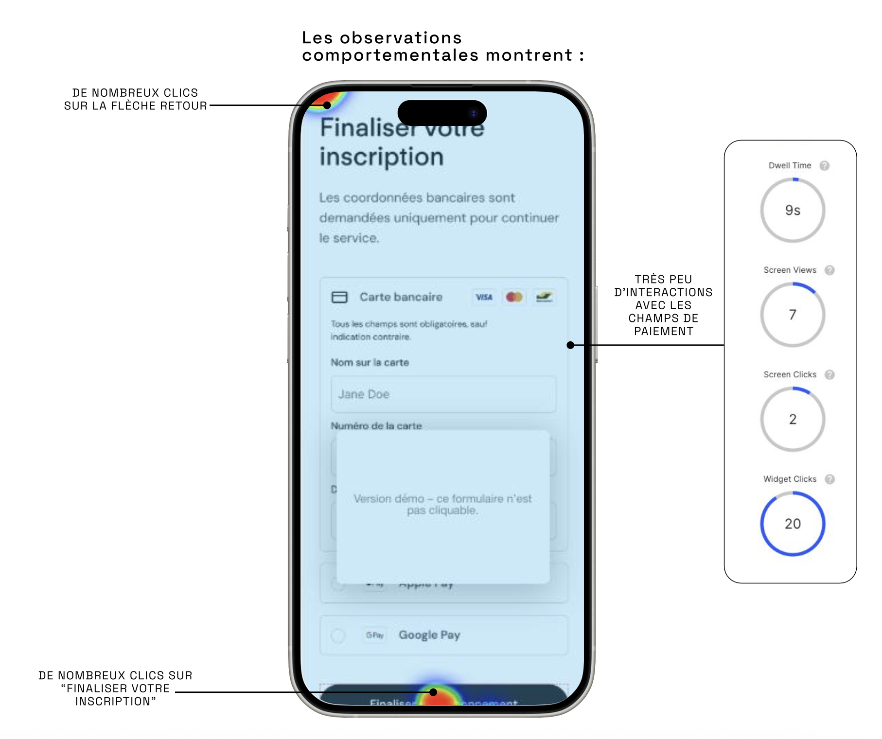
Individual segment: 44% success — the lowest score, driven by anxiety about the subscription itself: billing timing, cancellation terms, real level of commitment. Heatmaps showed users reaching the final payment screen, hovering, retreating, then re-approaching — a classic last-step abandonment pattern.
Importantly, the testing also ruled things out: no major structural or navigational problems were identified. The foundations were sound. The friction was concentrated specifically at the moment of financial commitment, a trust and framing problem, not an information-architecture one.
Recommendations
Based on the data, I proposed targeted, low-lift fixes rather than a full rebuild:
Visible reassurance near the subscription CTA ("no commitment," "cancel anytime," "no payment before final validation"), softer CTA language to reduce the perception of immediate commitment, and stronger ROI framing for the B2B segment specifically.
From research to production
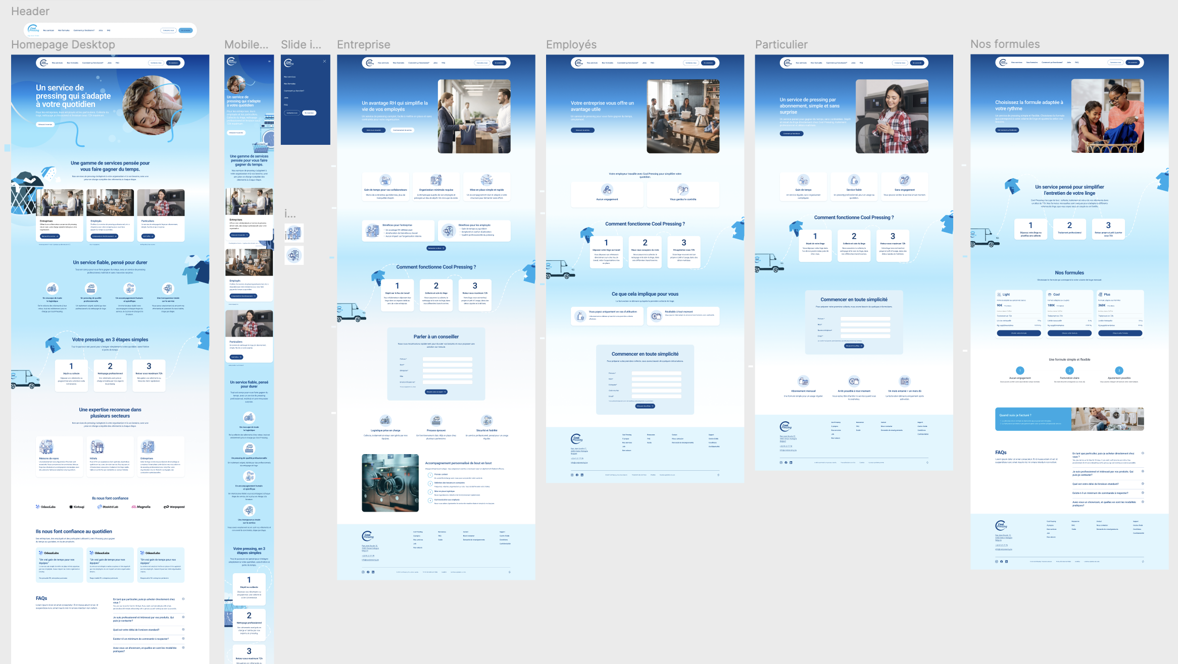
The client approved moving straight to design and build, without budget for a second testing round. Implementation required integrating with the client's existing Odoo CMS and established brand guidelines, which meant some interaction patterns from the original wireframes were adapted during build rather than shipped pixel-for-pixel, and some final decisions followed the client's prior instincts over the tested recommendations.
Reflection
The research clearly identified where trust broke down; implementation only partially reflected it, shaped by the client's timeline and existing assets. It's a reminder that good data doesn't always win the room, but it's still the right basis to design from.